


“It has been a pleasure working with the Highopes team for almost 3 years now!
We went from having no website and 0 inbounds leads to 20 average weekly inbounds a week and ranking #1 for all 5 of our top SEO keywords.”
Judson, Head of Revenue
Bespoke Financial

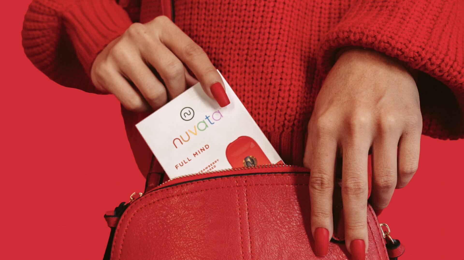
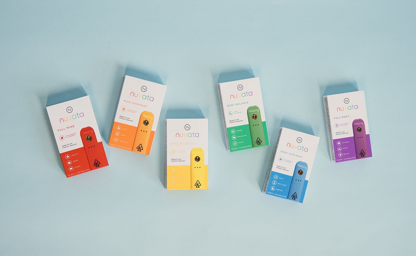
“If you are considering to design or create a new brand, look no further, Highopes has it all and does it all.
They strive for creating perfection for their clients, and they value the satisfaction of their clients over everything.”
Andy, CEO & Founder
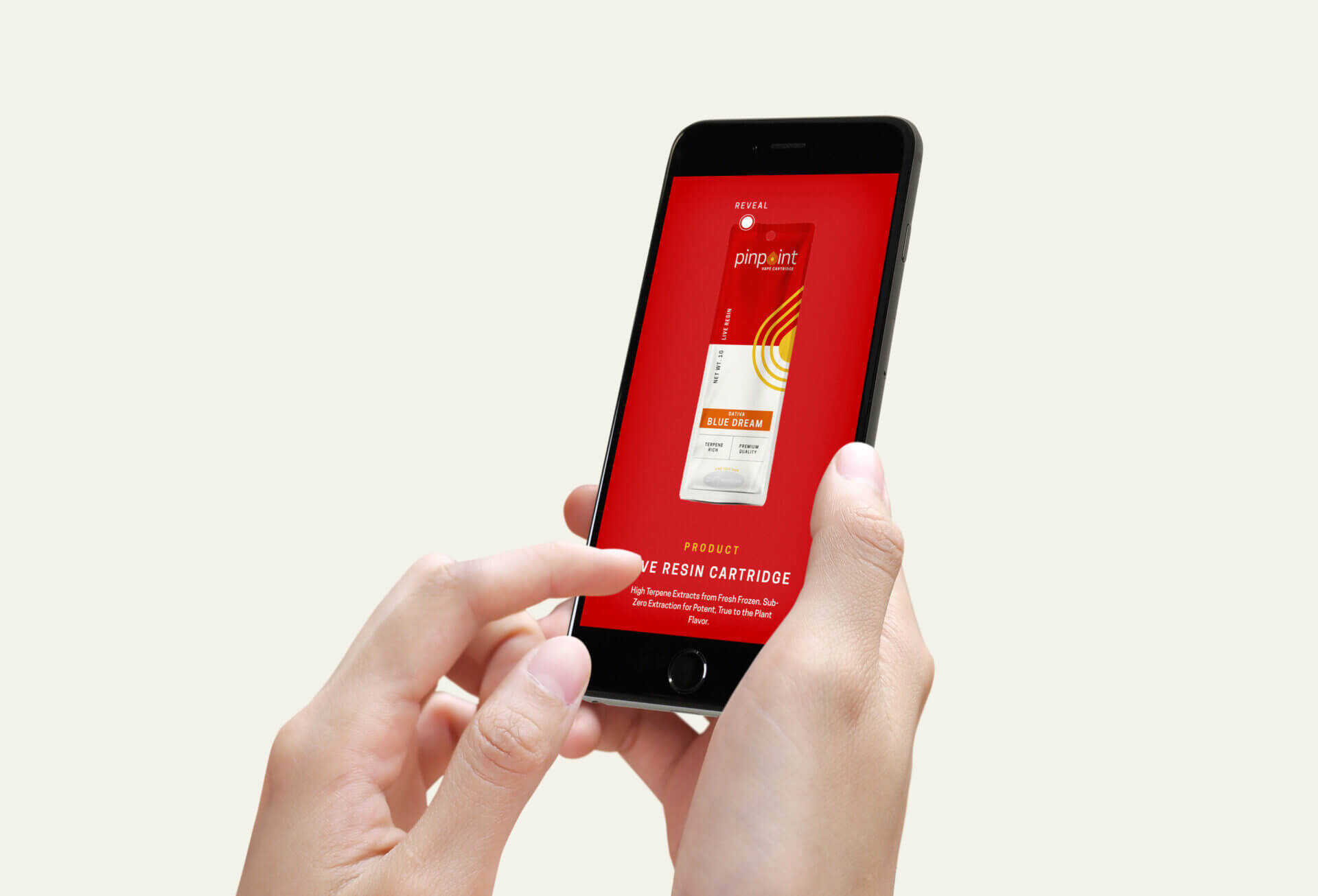
Nuvata

“Overall, HIGHOPES exceeded our expectations by a million percent.
We were so happy with the results of our partnership and continue to reach out to the team whenever we need any design and marketing help.”
Micaela, Managing Director Double Delicious

“The Highopes team was there for us from the beginning and has been seamless throughout the process of our website design and management.
The creativity and well thought out practices have produced a great website and increased our traction and sales.”
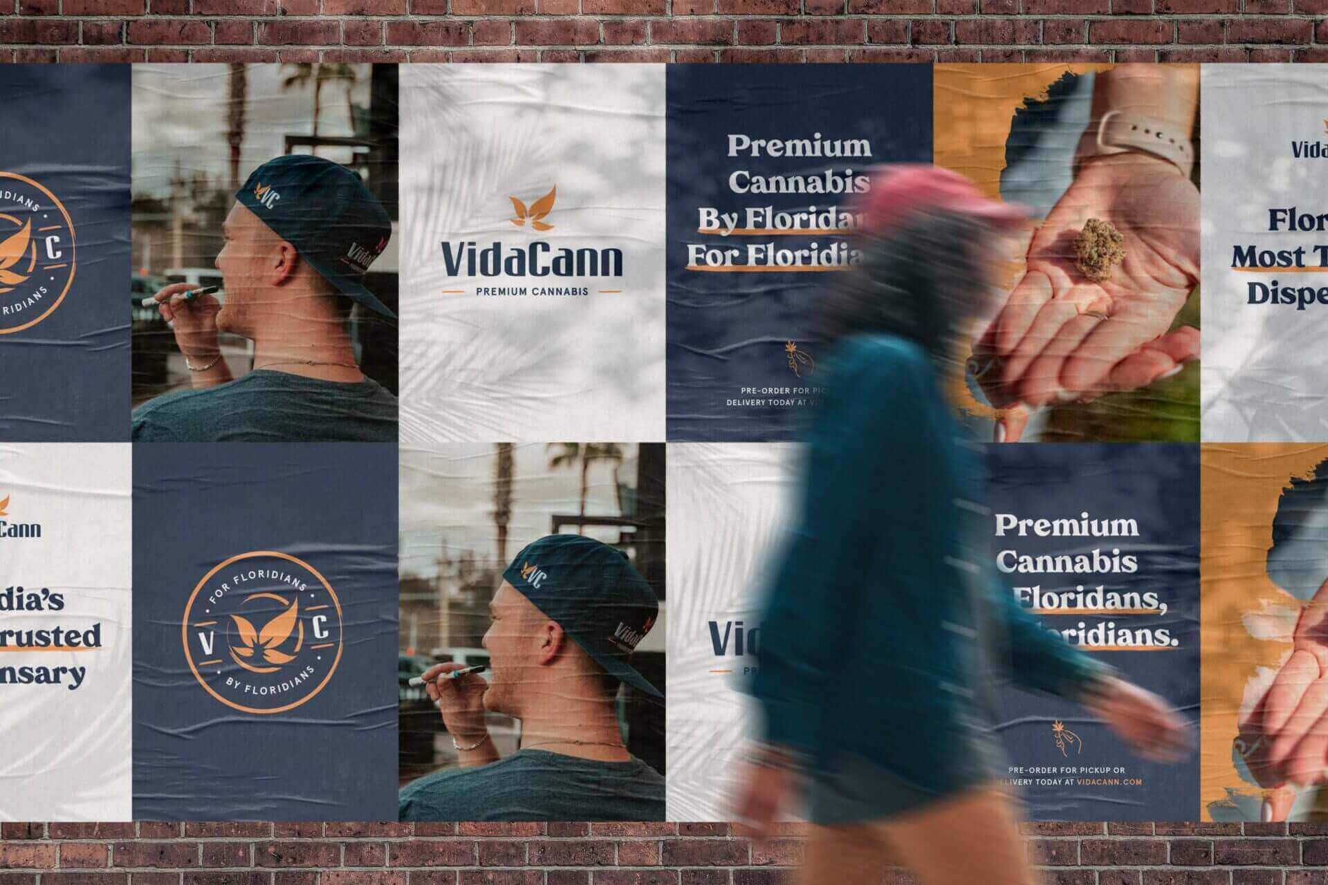
Peyton, Senior Vice President VidaCann

“The Highopes team was extremely responsive and thorough.
From the very beginning, Highopes focused on understanding the goals and culture of our company and this was reflected in the final product.”