ELEVATE YOUR
CANNABIS BRAND
Our cannabis branding agency provides branding,
website design and marketing services built for your success.


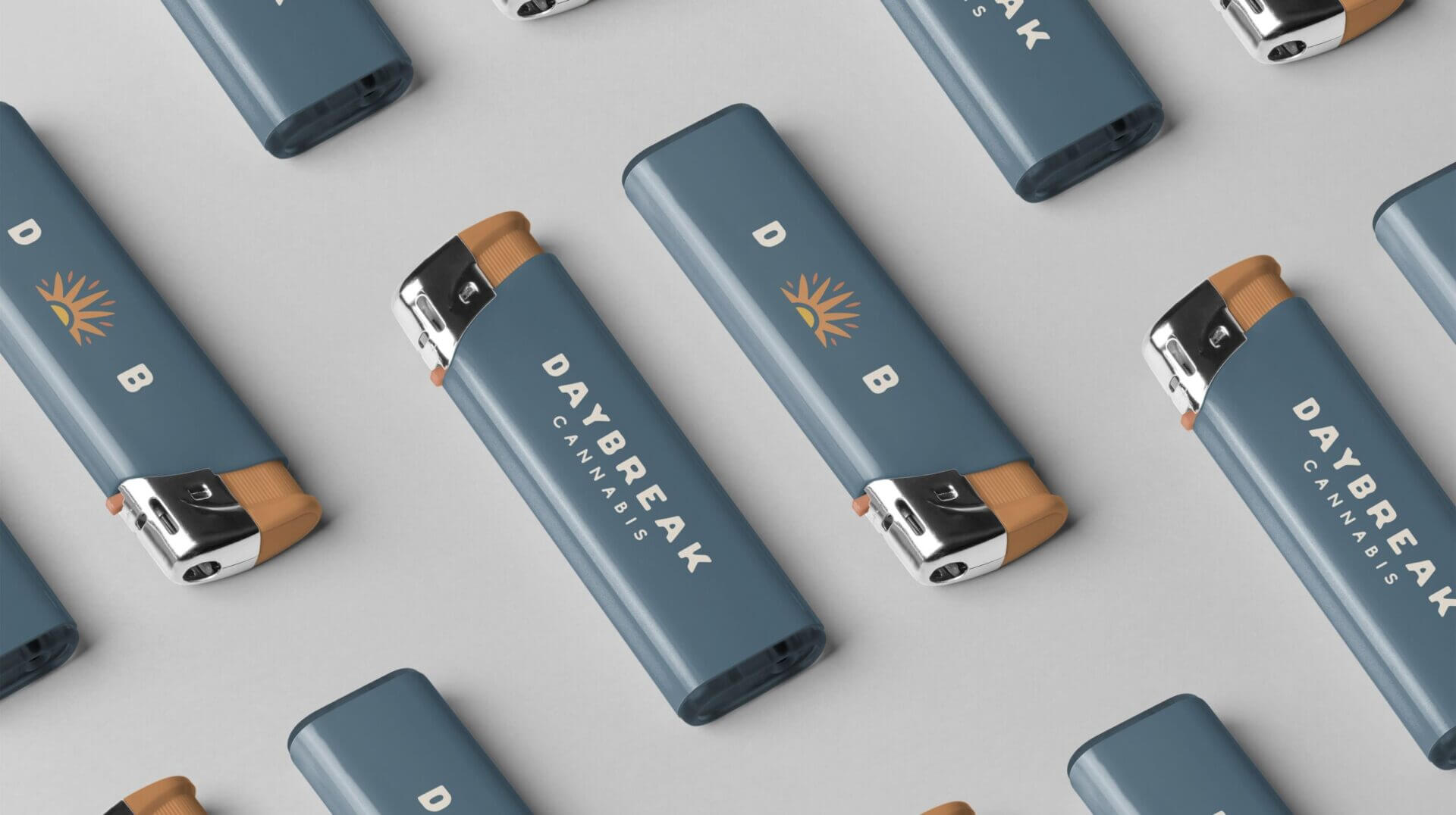
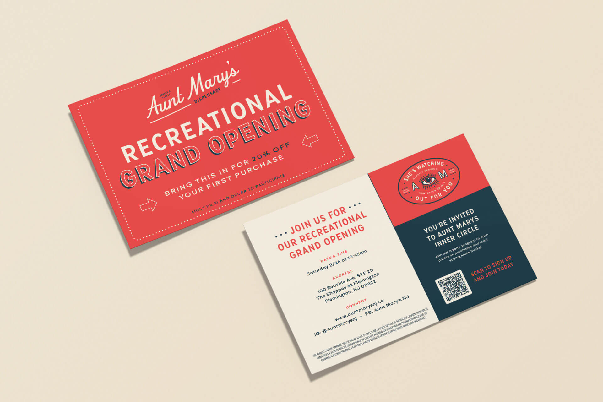
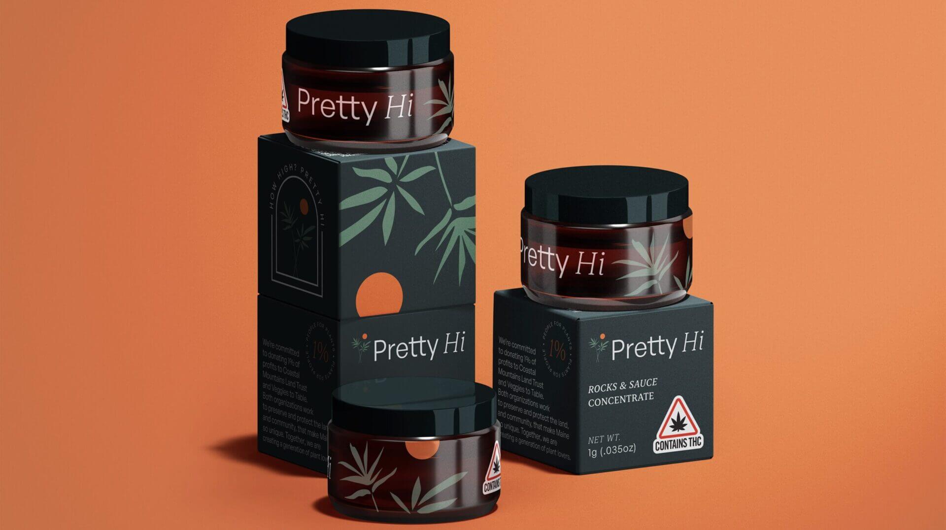
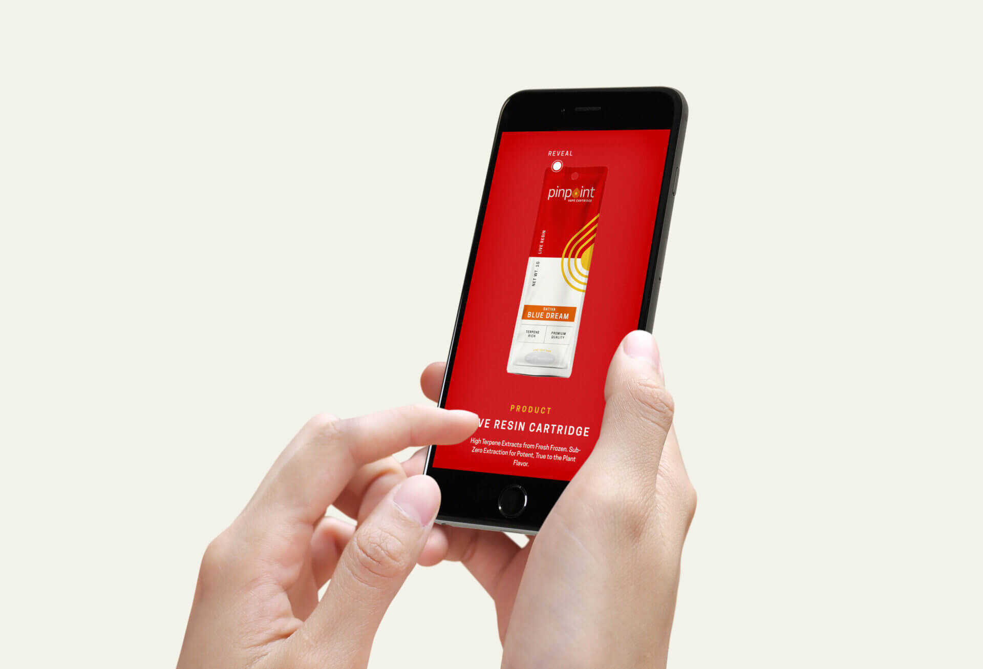


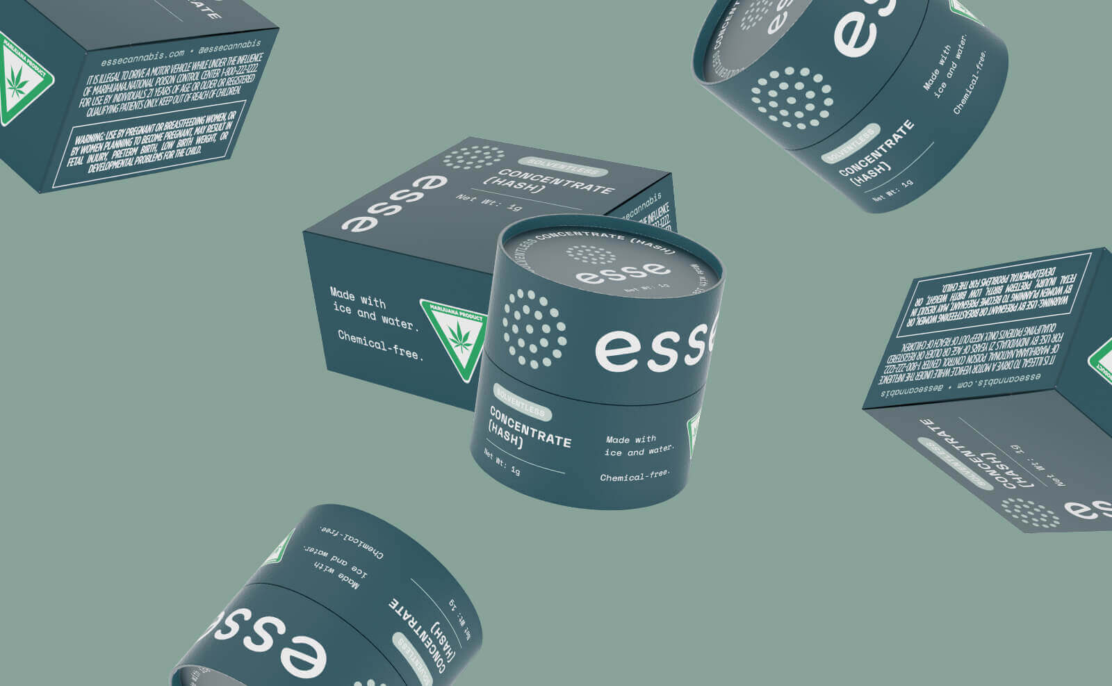


Our cannabis branding agency provides creative solutions customized for the cannabis industry.
We’re passionate cannabis advocates and experts dedicated to propelling your brand to success. As a cannabis branding agency, we offer a comprehensive suite of solutions tailored to your business needs, including:
Branding
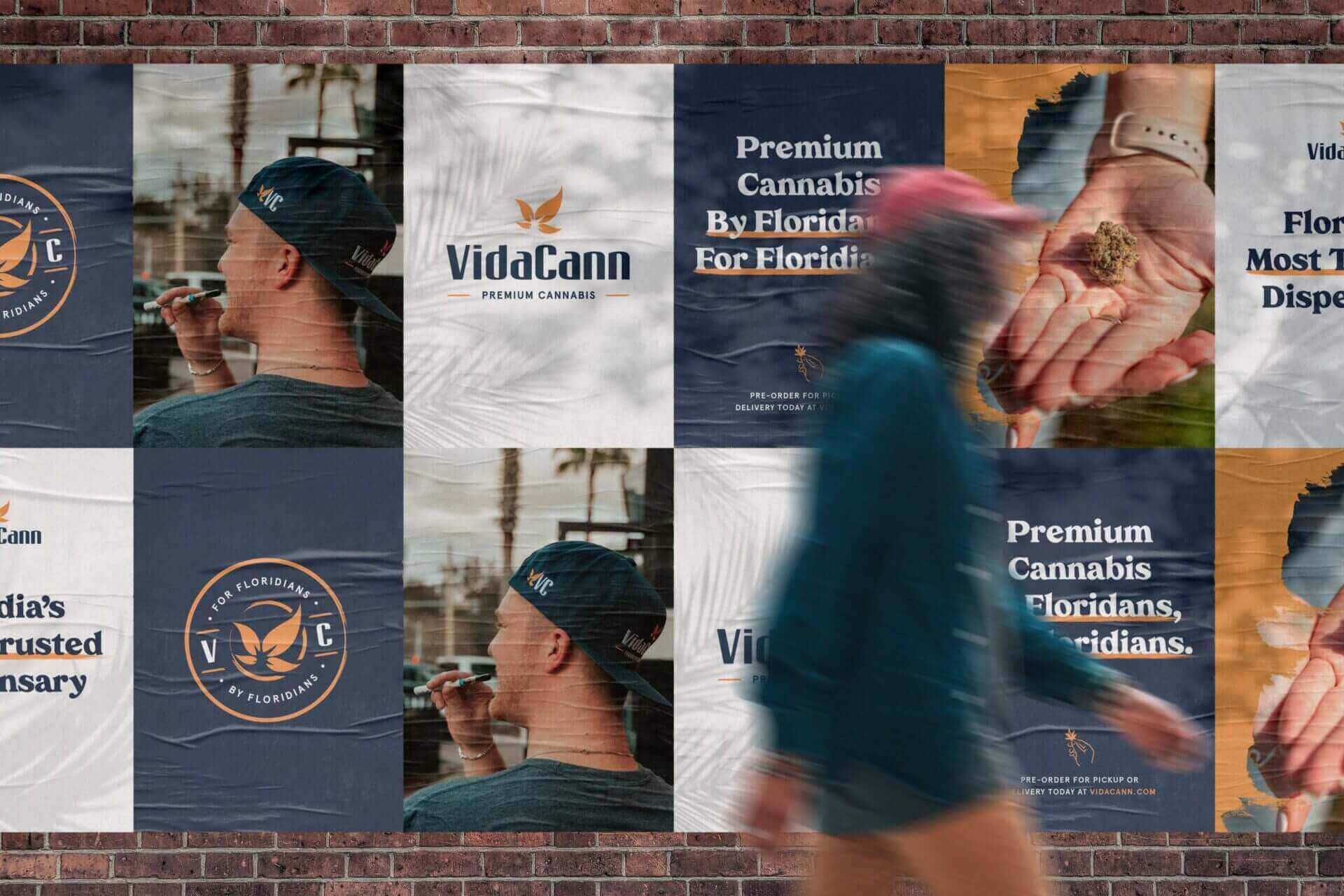
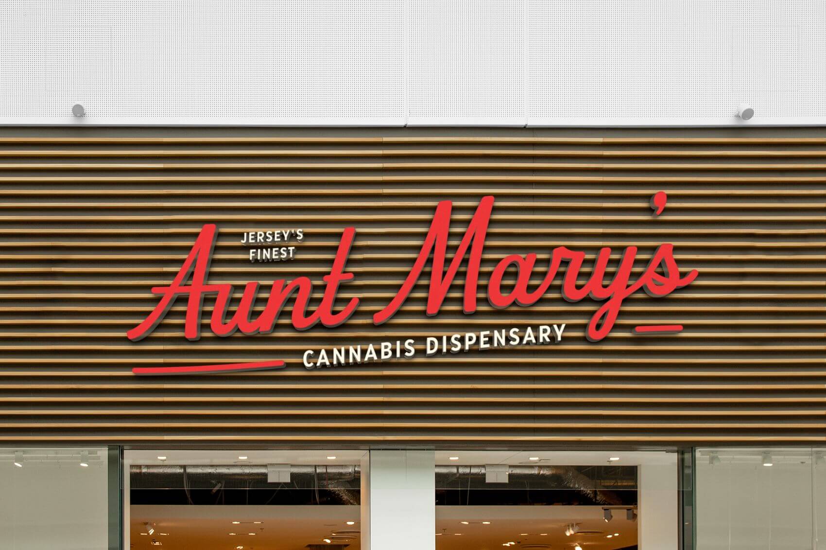
The brand identity is the flag of your business so we make sure you want to wave it loud and proud.
Packaging Design
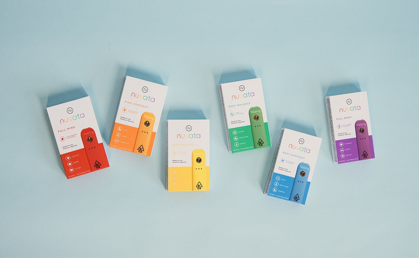
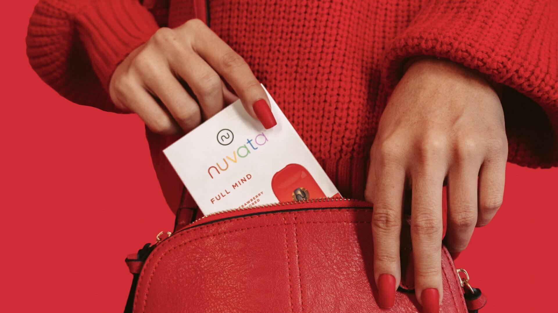
We make sure your packaging represents your mission, vision and values while standing out on the shelves.
Website Design
We’ll craft a user-friendly and visually stunning website that captures and converts visitors into customers.
Marketing
A good cannabis brand can go to waste if it’s not being marketed correctly. We can handle all your print and SEO needs.
Our cannabis branding agency provides creative solutions customized for the cannabis industry.
Don’t just take our word for it. Hear some success stories from our happy clients.

“It has been a pleasure working with the Highopes team for almost 3 years now!
We went from having no website and 0 inbounds leads to 20 average weekly inbounds a week and ranking #1 for all 5 of our top SEO keywords.”
Judson, Head of Revenue
Bespoke Financial

“If you are considering to design or create a new brand, look no further, Highopes has it all and does it all.
They strive for creating perfection for their clients, and they value the satisfaction of their clients over everything.”
Andy, CEO & Founder
Nuvata

“Overall, HIGHOPES exceeded our expectations by a million percent.
We were so happy with the results of our partnership and continue to reach out to the team whenever we need any design and marketing help.”
Micaela, Managing Director Double Delicious

“The Highopes team was there for us from the beginning and has been seamless throughout the process of our website design and management.
The creativity and well thought out practices have produced a great website and increased our traction and sales.”
Peyton, Senior Vice President VidaCann

“The Highopes team was extremely responsive and thorough.
From the very beginning, Highopes focused on understanding the goals and culture of our company and this was reflected in the final product.”
Anand, Chief Executive Officer Campfire Cannabis
Looking for some help? Here’s why you should consider our cannabis branding agency.
Partnering with HIGHOPES provides valuable advantages to strengthen and elevate your cannabis business, from expert strategy to impactful design.
Increase Brand Awareness
As an experienced cannabis marketing agency, we help your brand reach a wider audience.
Improve Customer Engagement
We create engaging foundations, content and experiences that foster long term customer loyalty.
Enhance Website Traffic
Our SEO-focused strategies help your site rank higher in search engine results and drive traffic.
Boost Store Sales
With our strategic branding and website optimization, we turn leads into sales to drive growth.
